Description infographic by David Coltan and Wendy Bollen
Our fourth assignment was supposed to be about making a poster out of our infographic, but since we made more of a poster than an infographic in our previous assignment, this assignment was rewritten.
Infographic
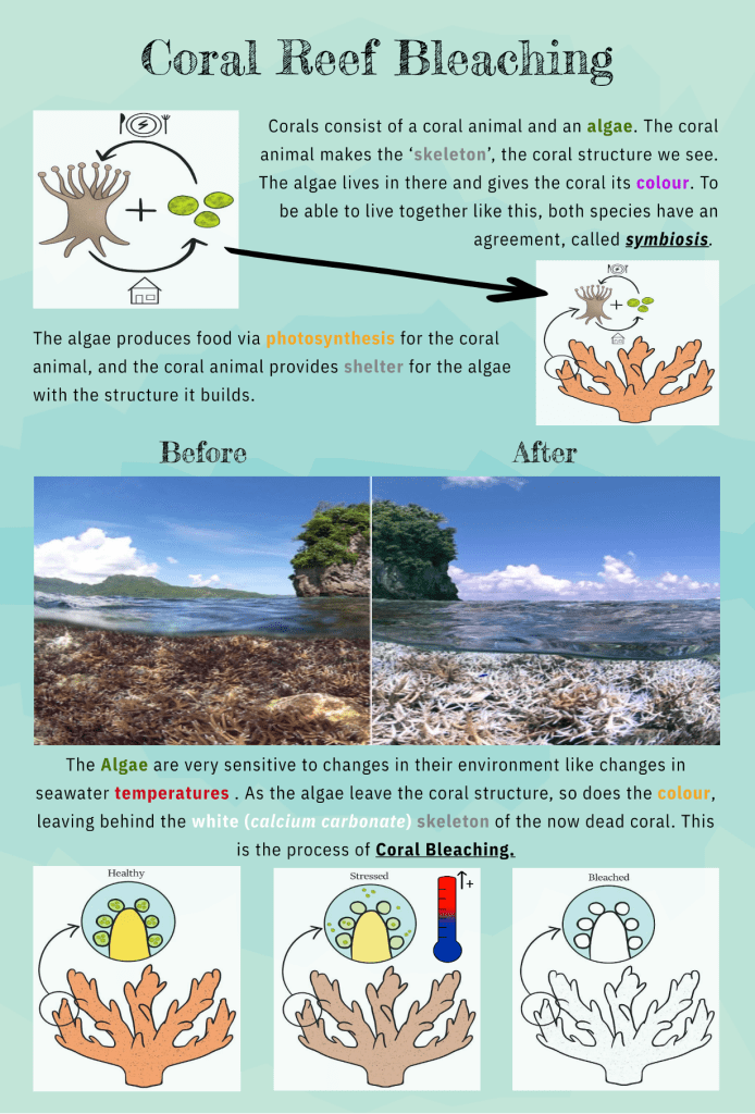
The scientific concept we choose is coral bleaching. We wanted to aim this infographic at teenagers/young adults (age range 14-22), because we think with this age group we’ll have the best chance that they pick up on this information and will do something with it. A lot of young people are fascinated by coral reefs and tropical places, and might even have swimming there on their bucket lists. If we can tell them coral reefs might not be there anymore when they have children or grandchildren, it might be enough to have them take some kind of action.
The audience for our infographic is still the same. But instead of having the processes told in easier wording, we tried to convey the same message with the use of illustrations and small descriptions instead.
Application of the learning theory
- Coherence effect/weeding?: only keeping the essential parts of the poster for the infographic so it stays clear which information we want to convey to the audience. We only kept the introduction about what a coral is and what coral bleaching is, and made those two ‘processes’ visual with the help of illustration that we made ourselves. We also only kept heating as a cause for coral bleaching, as more factors might make the infographic unclear. Too many (interesting) facts can distract from the main message.
- Signalling effect: We wanted the most important parts of the text to stand out, so the audience gets captured by that immediately. We did this by making the text bolder/different colour?
- Spatial contiguity effect: We tried to keep the text as close to the corresponding illustration as we could, to reduce confusion, and keep the reader focussed on that part long enough before they moved on to the next part.
Individual contribution
After the lecture we discussed together how we could transform the information of our poster into an infographic. We came up with the idea to make our own illustrations, since none we could find were copyright free. Wendy made the illustrations, and David put them all together in an infographic and decided which text would be fitting with the illustrations. We wrote the report together.
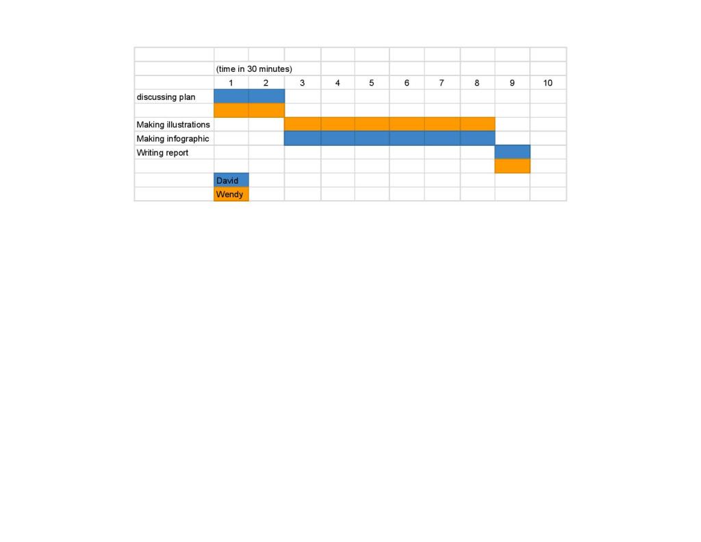
Last time we forgot to add a Gantt Chart, but we have made one this time. We spend more than our 4 hours individually on this assignment, since making our own illustrations took more time than we thought it would.